
-
Duration: 6 months
-
Type of project: Fintech app
-
Role: UX Designer
-
Responsibilities: Market Research, User Research, Information Architecture, UI Design, Prototyping, User Persona & Journey Mapping, Usability Testing & Iterative Improvement
-
Tools: Figma, UsabilityHub, Optimal Workshop, Miro, Google Forms
Overview
Context
PlutoPay was inspired by the frustration of managing various apps for different financial needs. It is a fintech app that combines essential financial features, including financial transactions, bill splitting, smart savings plans, financial insights & recommendation, empowering users to take control of their finances—all within a single, convenient platform.
Problem Statement
According to the findings of secondary research, users of similar fintech apps face challenges such as hidden fees, lack of personalised services, lack of trust and knowledge on financial management. The existing financial tools and platforms are fragmented, making it difficult for users to seamlessly manage their finances in one place.
Solution Statement
A responsive financial web app that combines essential financial features in a single, personalised, user-friendly platform while continuously adapting to users' evolving needs. The platform will incorporate advanced security measures, such as 2-factor authentication, to ensure the protection of user data.
Design Process
-
Competitive Analysis
-
User Research
-
User Stories
-
Affinity Mapping
-
User Personas
-
User Journeys
-
Business Requirement
-
User Flows
-
Information Architecture
-
Wireframes
-
Mid-Fidelity Prototypes
-
Usability Testing
-
Preference Testing
-
Iteration
-
Design system
-
Design Collaboration
-
High-Fidelity Prototype
Competitive Analysis
In-depth competitor analysis was conducted to identify where similar platforms that are currently available on the market excel and where they fail to meet market needs.


User Research
Extensive user research, involving both interviews and surveys, has been conducted to uncover key insights: the most used/valued fintech features, potential app solutions to users' financial challenges, and the factors shaping trust in financial apps.
MOST USED FEATURES

TRUST FACTORS

PROPOSED FEATURES
-
Withdraw money using the app
-
Human & AI customer support
-
Personal financial advice
-
One app for all financial activities
-
Reward program (Cashback)
CHALLANGES
-
Managing debt
-
Saving for retirement
-
Staying on top of monthly expenses
OPPORTUNITIES
-
Budgeting and AI financial recommendation
-
Smart savings
-
Quick loans
Affinity Mapping
In analysing data gathered from user research, I utilised affinity mapping to enhance my understanding of user needs and preferences.


User Persona
Following the user research, I crafted two personas to give me a human touch to collected data, making it easier to design with users in mind.


User Journey Mapping
Persona: Markus Schmidt
Scenario: As dinner concludes, the waiter brings the bill to Marcus and his friends. Everyone decides to split the bill, and Markus, aware that he has the perfect tool at his disposal, takes out his smartphone and opens his trusted fintech app. With the bill in hand, Markus begins the process of dividing it among his friends using the app.

Persona: Sarah Miller
Scenario: During their work lunch break, Sarah and her colleague discuss saving for their kids' futures. Sarah's colleague shares that she uses a fintech app for her child's future savings. Inspired, when Sarah returns home, she swiftly downloads the app, determined to start saving for her daughter's future education.

User Flow


Information Architecture
To gain a deeper understanding of the content and functions organisation within the app, I organised a (closed) card sorting exercise using the Optimal Workshop as a tool. In this activity, participants were tasked with sorting a list of various features into their respective categories. This activity helped me to understand how different elements relate to each other so I can build flows, navigations and organise information within the app following users’ mental models.

Iterative Design Process
In bringing the PlutoPay app to life, the iterative process began with initial sketches, transitioning from paper to digital wireframes for improved visualization. Subsequently, mid-fidelity wireframes and prototypes underwent usability testing, leading to refinement based on user feedback for enhanced intuitiveness and a seamless experience. The transition to high-fidelity involved designing wireframes and conducting preference testing. Insights from the tests guided the development of a comprehensive design system, complemented by secondary research on Psychology in design. High-fidelity wireframes were then crafted, following material.io guidelines. Feedback from professional designers guided the final adjustments, resulting in the refined and user-centric PlutoPay app.

Low-fidelity wireframes/sketches
Send money


Bill Splitting


Saving Plan


Testing the Mid-fidelity Prototype
Usability test
The goal of the usability test was to evaluate the ease of use and intuitiveness of Plutopay's main features.
All participants successfully completed the usability test and noted that the task flow was clear and straightforward. However, the usability test results revealed the need for changes in some design elements.
-
Concerning the upper bar menu, many participants felt disoriented when prompted to navigate to specific features, often resorting to repeatedly scanning the screen vertically in search of the required options.
-
In response to participant confusion during selecting a receiver in the 'send money' feature, redesigning components in the receiver selection screen was initiated. Notably, one participant recommended relocating the search bar higher on the screen for enhanced usability. This redesign is anticipated to lead to better orientation and an improved user experience.
-
Additionally, the income/expenses graph appeared redundant to most participants. They suggested a preference for a breakdown of expenditures upon landing on the budgeting page.

Simplify the upper menu bar by retaining only the notification feature, ensuring that the majority of features are accessible from the bottom menu bar. Additionally, the "Transaction" history is added to address user needs, offering a complete overview of their transaction history.
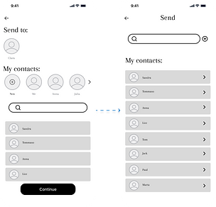
The search bar is relocated to the upper section. Also, the flow is simplified by removing the continue button, and introducing a direct action on the contact list. Now, tapping on a contact instantly redirects the user to the next screen.

The spending insights breakdown is now presented on the graph, and for earning insights, users can utilise a filter chip to display an earnings insights graph. Another filter chip offers options for different time periods (week, month, year).
Preference test
Preference testing was done using UsabilityHub and the objective was to see wether the targeted participants prefer dark or bright background.
The test results indicated a preference for the darker background, mainly because it is gentler on the eyes.

Design System
Using insights gathered from user research and testing, an understanding of user needs, and a deep dive into emotional design research, I developed the visual design of Pluto Pay. This blend of insights influenced every aspect of Pluto Pay's look, from colors that connect with user emotions to user-friendly interface elements for a seamless experience.
From a practical standpoint, a dark background enhances visual comfort, as suggested by the preference test. It reduces eye strain and glare, contributing to a more pleasant user experience, particularly during prolonged usage. Psychologically, a dark background can evoke a sense of professionalism and luxury, aligning with the serious and secure nature of financial transactions that PlutoPay aims to convey.
The primary color, blue (#0172CB), is chosen for its psychological associations and practical benefits. Psychologically, this shade is associated with trust, reliability, and stability—essential qualities in the financial sector.

Peers' Feedback
After collecting feedback from potential users, I consulted with design professionals to obtain their insights, which in turn guided additional improvements in the design. Furthermore, upon reviewing material.io, certain components were refined to align with UI standards.

High-Fidelity Prototype
Send money

Split the bill

Saving plan
